BODDY

by
ein-des-ein
About
BODDY connects the travel and fitness industry. Its partners are well-known online travel agencies (OTAs) while its clients are fitness operators of any type (regular gyms, boutique studios, personal trainers).
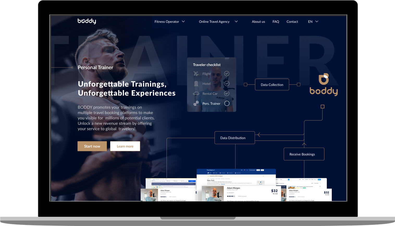
BODDY collects data from operators and distributes it to partners, where the offers become visible. By doing so, millions of travelers are able to digitally search, book and pay for the most suitable workout in any given destination, which includes online workouts as well.
It’s a win-win-win situation, as the traveler saves time and lives a healthier lifestyle, while fitness operators have access to a much broader client base, and booking platforms unlock a new revenue stream.
Sector: OTA, Fitness operators
Audience: travelers, fitness goers
Lead designer: Michael Chepurnyak
Discipline: Identity, UI/UX web design
We used the concept of lines to symbolize a ray that has a starting point and no final destination. With this idea we make an association with marking lines, guides, and pointers that surround us every day, whether we are working out or traveling.
To finish the concept and focus on combining traveling and fitness, we added a simple and revealing idea of overlaying different shapes with different colors to create something new and outstanding.
For the logo we used D letters from the brand name and transformed them into a simple shape. Then we created the final logo icon based on our concept.
Negative space around the logo provides a good visibility and readability.
Main Colors
Fonts
Lato is a sans serif typeface family created in the summer of 2010 by Warsaw-based designer Łukasz Dziedzic (“Lato” means “Summer” in Polish). In December 2010 the Lato family was published under the Open Font License.
Result
BODDY
Identity
UI/UX Design
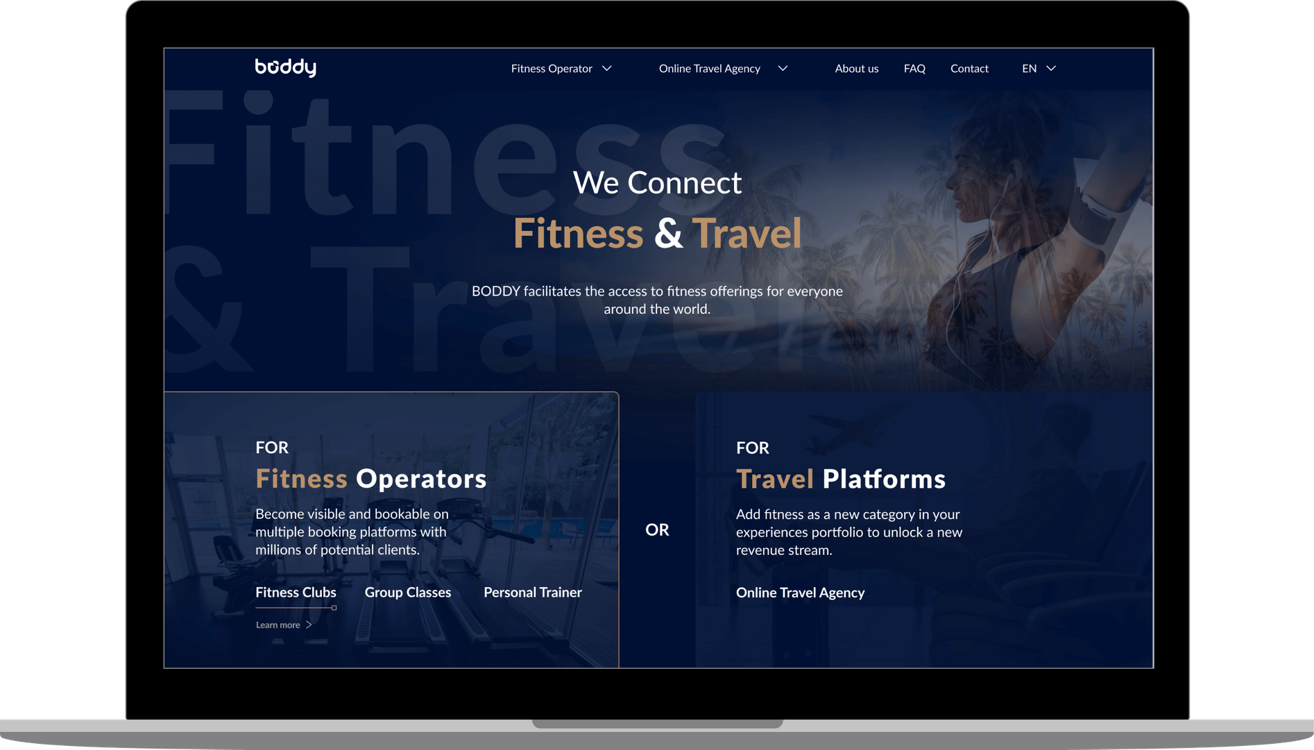
For Fitness Operators
For Travel Platforms
and
BODDY connects the travel and fitness industry. Its partners are well-known online travel agencies (OTAs) while its clients are fitness operators of any type (regular gyms, boutique studios, personal trainers).
BODDY collects data from operators and distributes it to partners, where the offers become visible. By doing so, millions of travelers are able to digitally search, book and pay for the most suitable workout in any given destination, which includes online workouts as well.
It’s a win-win-win situation, as the traveler saves time and lives a healthier lifestyle, while fitness operators have access to a much broader client base, and booking platforms unlock a new revenue stream.
Sector: OTA, Fitness operators
Audience: travelers, fitness goers
Lead designer: Michael Chepurnyak
Discipline: Identity, UI/UX web design
Identity creation
Web & Mobile UI/UX Design
Web Development
Brand Book
IDENTITY
Logo
We used the concept of lines to symbolize a ray that has a starting point and no final destination. With this idea we make an association with marking lines, guides, and pointers that surround us every day, whether we are working out or traveling.
To finish the concept and focus on combining traveling and fitness, we added a simple and revealing idea of overlaying different shapes with different colors to create something new and outstanding.
For the logo we used D letters from the brand name and transformed them into a simple shape. Then we created the final logo icon based on our concept.
Negative space around the logo provides a good visibility and readability.
DESIGN SYSTEM
Main Colors
Color is an important part of the brand and the whole visual style, because brand recognition is often based on the color combinations.
Fonts
Aa Bb Cc Dd
Lato is a sans serif typeface family created in the summer of 2010 by Warsaw-based designer Łukasz Dziedzic (“Lato” means “Summer” in Polish). In December 2010 the Lato family was published under the Open Font License.
Lato Typeface — headers, text blocks
ABCDEFGHIJKLMNOPQRSTUVWXYZ
abcdefghijklmnopqrstuvwxyz
1234567890
UX/UI DESIGN
UX / UI Design
Wireframes
The next step was to create low fidelity wireframes. The task was to create 4 different pages aimed at different target audiences: fitness clubs, personal trainers, dance and yoga studios and Online Travel Agencies.
Convenient interface
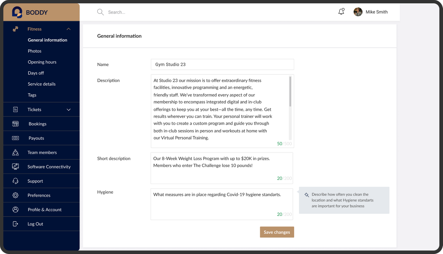
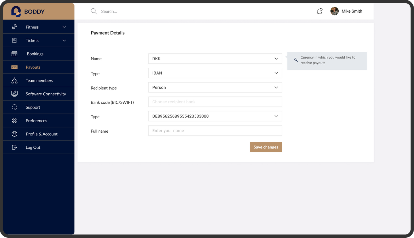
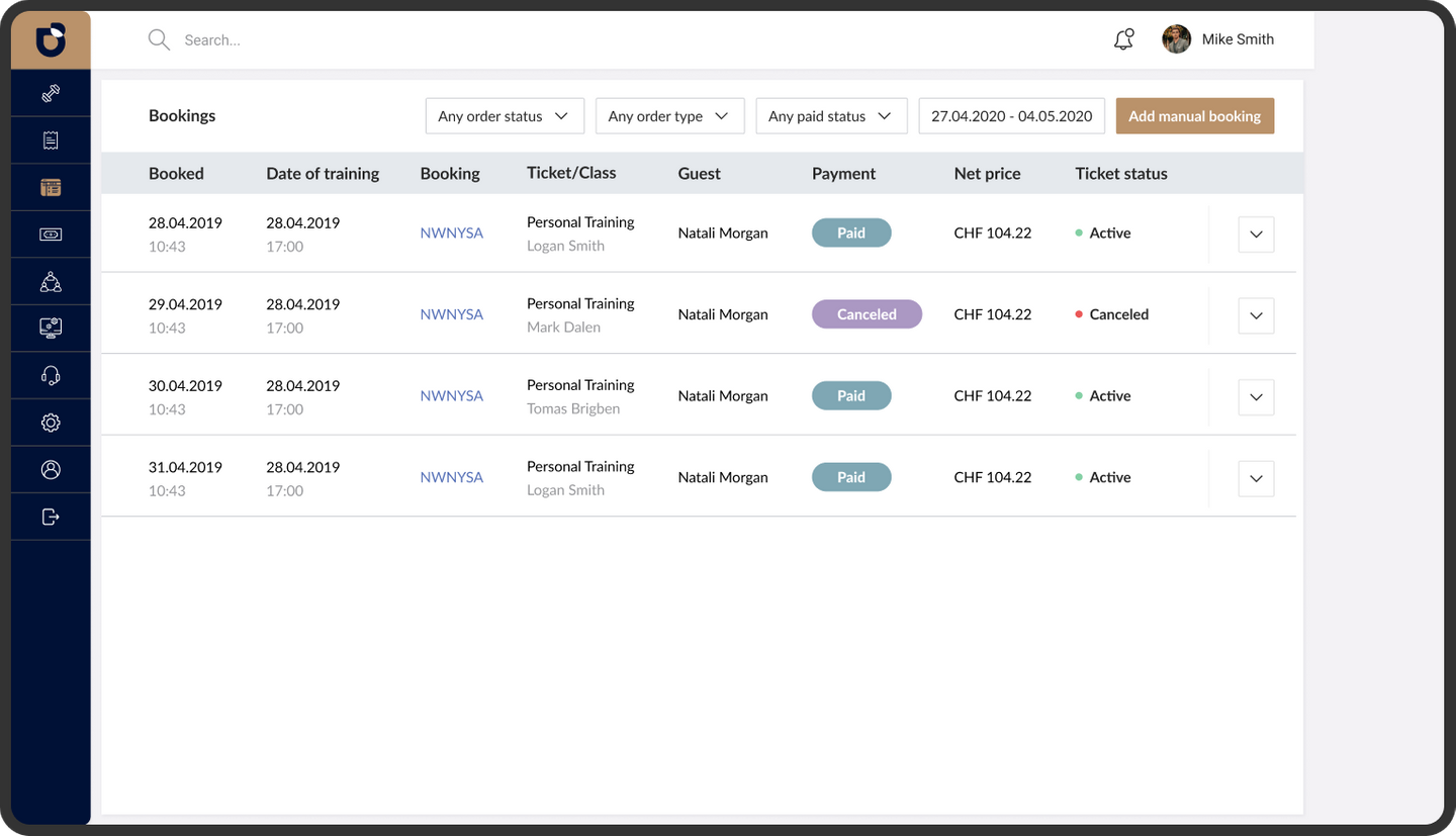
To collect data from the fitness providers we created a dashboard interface for gyms, personal trainers and class arrangement.
Personalized service
The interface facilitates the uploading of data like personal and activity descriptions, images, tickets, amenities, opening hours, payment details, etc.
CRM and Boddy
Because many gyms already use their own CRM systems to manage their property (tickets, accounting, workforce planning, etc.), it is easy connect it with the Boddy interface in order to smoothly align everything.
To distribute the data to B2B partners (OTAs) in the travel industry, the team created an interface for partners where they can get the data via API or Whitelabelling.
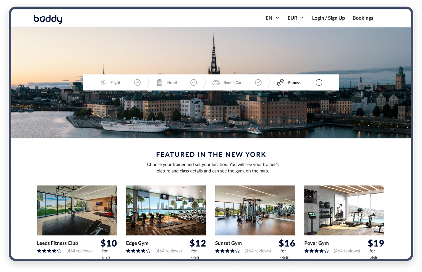
OTA Main page
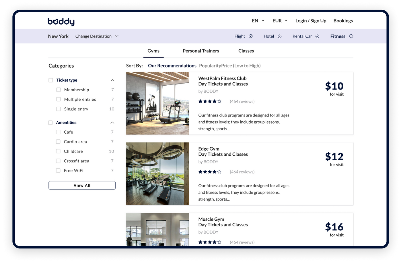
After the user buys a plane ticket, makes a hotel reservation and rents a car, they can initiate the search for a suitable fitness studio. There is whole page dedicated to fitness club options.
Fitness club pages
On a fitness club page, users can see the images, description, prices and other detailed information about the club.
They can also choose how they prefer to exercise: in the gym, with a personal trainer, or in a group training session.
Classes
If a user wants to exercise in group workouts only, they can select an appropriate category with the filter and in the results they will see a list of fitness clubs that offer group classes.
Personal trainer
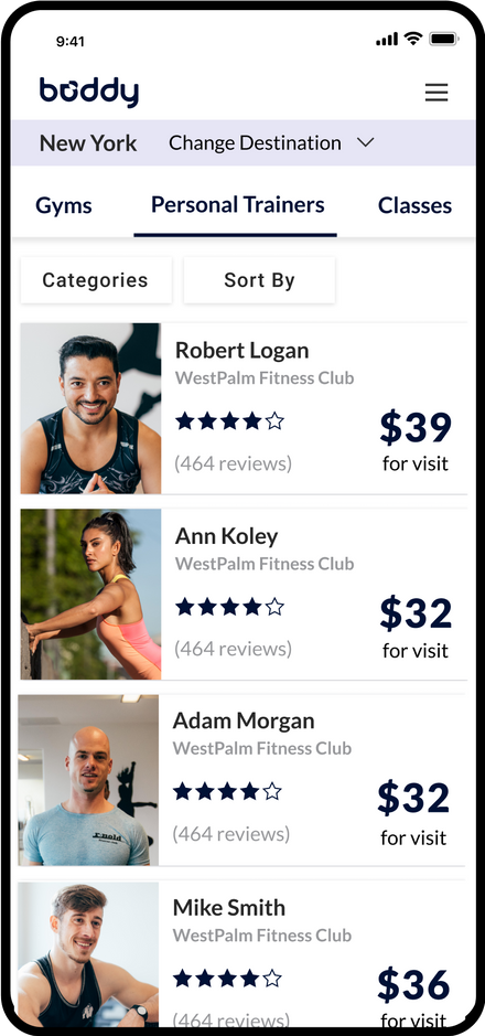
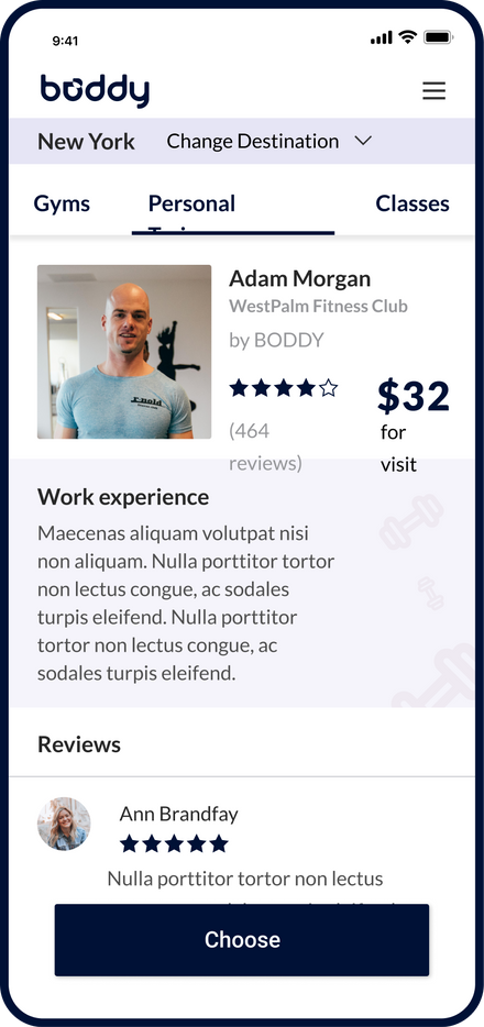
Also, users can choose a personal trainer to improve the quality of their training sessions. On personal trainer pages, users can read about the trainer's experience and reviews about them.
Result
BODDY now has an innovative web app interface that makes it easy for travelers from all over the world to find fitness opportunities when they travel for work or leisure.

