JETBUD
About
PROJECT DESCRIPTION
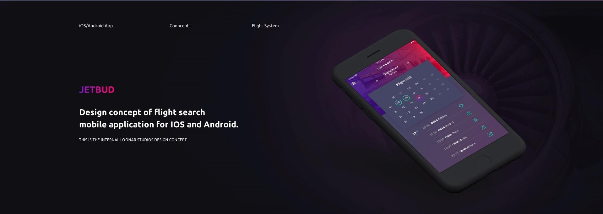
Are you looking for a cheap flight and want to find it quickly? Check out Jetbud! This is the internal Loonar Studios design concept of flight search mobile application for IOS and Android.
CHALLENGES
The idea was to try combining the design elements that are very difficult to combine.
SOLUTION
We started developing Jetbud from huge brainstorming. Our team consisted of 1 UI and 1 UX designer, and business analyst. After a long discussion and analysis of top design trends and nearest competitors, we have finally agreed on the niche for our app and prepared a list of its possible features.
We decided to use a mix of acid colors. This is exactly what we would never suggest to our clients. And that is why we wanted to try it ourselves.
From the start, our designers got a full carte blanche. They were allowed to create whatever they want.WIREFRAMES
We have skipped this part as it is not a real project. We simply did not need wireframes.
DESIGN
As mentioned, we had an idea to compound colors, which typically noone uses for web and mobile design. Our UX designer has created a bunch of interesting features, such as:
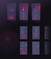
1. User-friendly “find flight” system, where one can choose location and destination, dates, airport, amount of persons, and time of the flight.
2. Own chat system. It is simple yet comfortable feature, allowing to share emotions with people.
3.The calendar that shows you dates with scheduled flights.
4. Lots of other features.UI designer created an eye-catching contrast, using a mix of green-blue and red-violet colors, As a result, the project looked really unusual.


