MROSupply

by
Rondesign
About
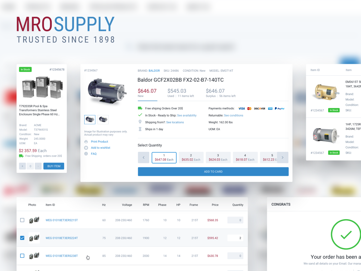
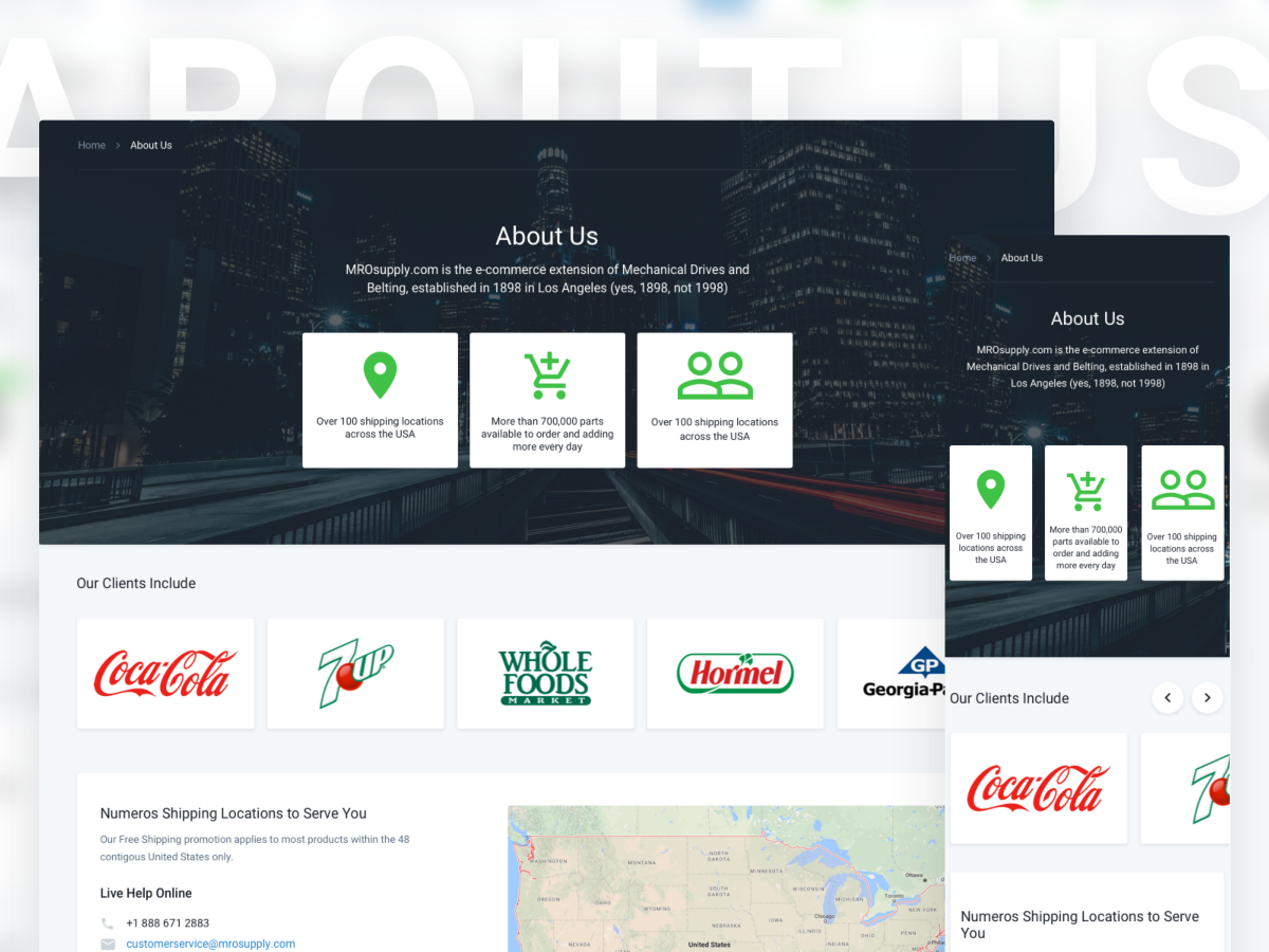
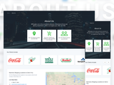
MroSupply — is the company that has been selling industrial goods since 1898. The website mrosupply.com is more than 6 years old now, at the moment it has more than 200 brands and 700 000 available products for purchasing. Among their regular customers are such brands as Coca Cola, 7up, United, Whole Foods, Hormel Foods and many others.
Deliverables
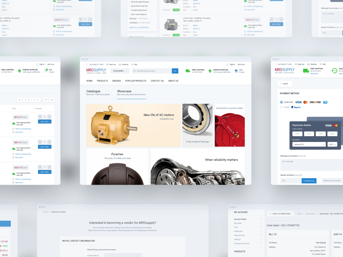
Within this project, we created the entire visual part for the user. The list of works includes such services as:
• Research;
• Strategy;
• User Experience (UX);
• Wireframing;
• User Interface (UI);
• Visual Design;
• Prototyping;
• Guides;
• Front-End Development;
So, in fact, we did all the work except Back-End development, as far as the customer had his own team that has been working on this project for a long time.
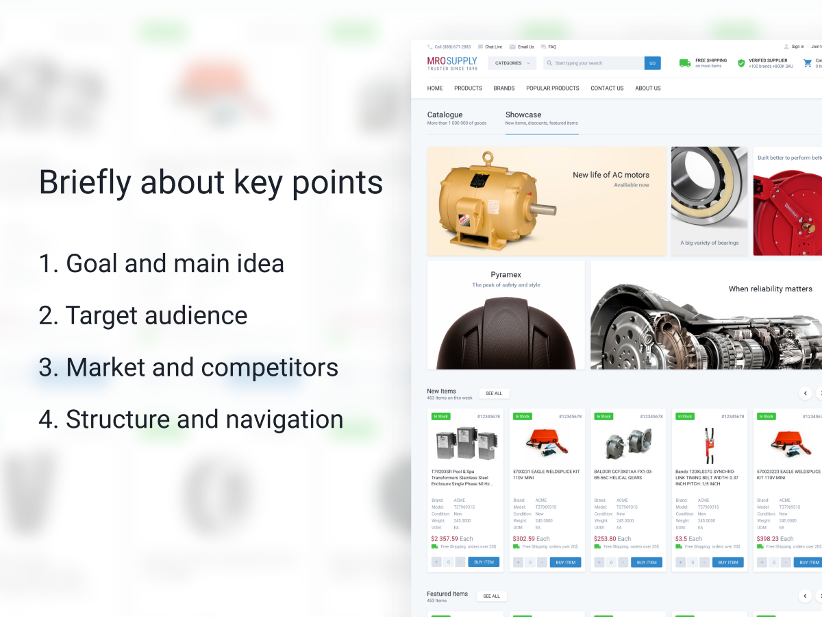
Initial datas or Briefly on the main
In this project we were very lucky with a client, he was aware of everything that happens on the website and knew exactly what needs to be changed and what to be improved. The most important thing is that our client could answer the question — why this needs to be done?
1. Goal and the main idea
As far as the client’s goals quite often diverge with the goals of the project, we divided them. This works well in case we need to remake the ready-made project.
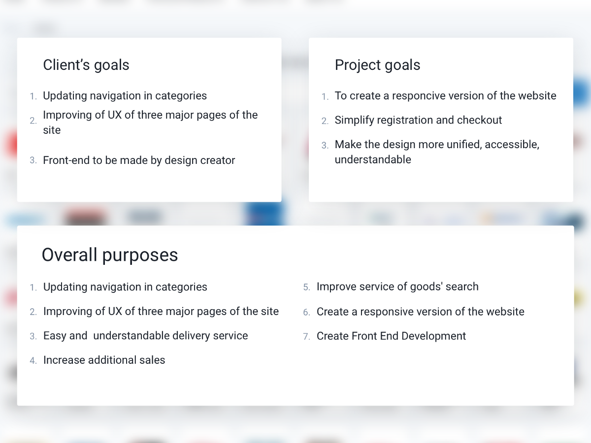
Client’s purposes
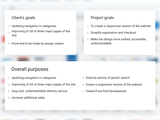
Initially the client did not have the clear brief, he had an understanding and list of mandatory requirements for improvement. The list included such items as:
• Updating navigation in categories;
• Improving of UX on three major pages of the website (product details, product listing, home page);
• Front-End to be made by the design creator;
Purposes of the project
As long as the company and the client are actively engaged in analytics and marketing, they were interested to see the look from the outside. It means, to see our Research and proposed solutions. The principal ones were:
• To create a responsive version of the website;
• Simplify a Registration and Checkout;
• Make the design more unified, accessible, understandable;
2. Target audience
The market of the website is quite wide. The main target audience are employees of companies who purchase equipment using stationary computers installed at their working places.
3. Market and Competitors
The market is quite wide. There are not many competitors, but those who are have quite strong positions. Problems of all competitors are different (delivery, description of goods, the ability to quick issue of goods).
4. Structure of the website and the navigation
The Client did not want to change a lot of navigation on the website, because it would hit the sales much, due to the fact that the current audience of the website is not active Internet users and any changes can confuse the
There were also a few items such as problems with complicated registration and ordering on the website. These problems had to be corrected.
Project’s goals
Overall purposes
1. Updating navigation in categories.
2. Improving of UX on three major pages of the website.
3. Easy and understandable delivery service.
4. Increase additional sales.
5. Improve service of goods’ search.
6. To create a responsive version of the website.
7. To create Front end development.
Client’s goals
During the existence of the project the Client has accumulated a critical mass of problems, according to SEO, the functions that does not reply to current requirements anymore. It was decided to redesign the website in accordance with new goals.
1.Updating navigation in categories.
With the developing of the website number of categories was greatly increased and the previous design could not display them in a user-friendly form.
2. Improving of UX on three major pages of the website (product details, product listing, home page).
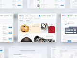
As it is known there are 4 key pages in e-Commerce websites (home page, product listing, product page, checkout) where users spend most of their time and which have strong influence on sales. The client experimented quite a lot with the first three and he had a vision of how they should look.
3. Front-End Development.
One of requirements of the Client was that the front-end should be done exactly by same person who made the design. The client reasoned his decision by the fact that same person clearly understands how the project should be look like from a technical point of view.
Goals of the project
During the research, we learned that the project has quite a few other goals that would be useful for users.
1. Responsive version of the website.
It turned out that a wide number of users are viewing the website with a low resolution. The current website is designed for a minimum resolution of only 1000px, which means that users with a lower screen resolution are already experiencing difficulties in using the website. Also the responsive version affects SEO promotion very well. Google has recently reduced positions of websites, which has no mobile version.
2. Increase additional sales.
During the study of the website, we realized that in comparison to competitors, it has poor realization of additional sales.
3. Increase awareness of the user.
After analysing the website, we came to conclusion that the user is slightly involved in the process of buying and interacting with the website.
For example, after completing registration there is no notification that the user has been registered on the website. If the Cart contains unissued goods, the website does not remind about this by mail, for user to complete the order. No notifications come to email after changing the status of the order.
4. Easy and understandable delivery service.
There are many mentions on the website, that if you make an order for a certain amount, then the delivery will be free of charge. Users complained that it is not obvious to them how free shipping is calculated. We offered the client to complete this function, and also it is possible to make a mobile application where you can see the status of delivery.
Overall purposes of project
Usually during the disputing and after the results of our research, the customer’s goals are changed in accordance to new information. In a result, the list of goals for us looked like this:
1. Updating navigation in categories.
2. Improving of UX of all major pages of the website
3. Creation of an easy and understandable delivery service
4. Increase additional sales
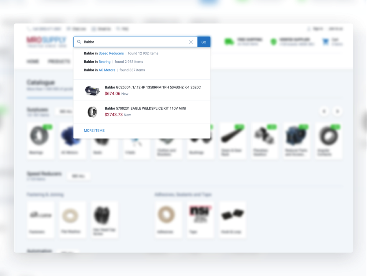
5. Improve service of goods’ search
6. Responsive version of the website.
7. Front-End Development.
During the dialogue, we learned some important details:
• Client decided to redesign the website to unload the call centre.
• There was an original goal to increase additional online sales.
• MROsupply clients usually make purchases in two scenarios. In the first case they just call the support service, in the second they buy on the website using a search when they know the exact brand and model of what they need.
Target audience
As the variety of users in the project is very wide, we decided that it makes sense to highlight the main features of the target audience.
1. Most users view the website with devices with low resolution.
From the customer, we learned that 11% of users use IE8, and Windows XP. Basing on this information, it can be assumed that users buy products on the website from work devices.
2. Like to call directly to the support service to place an order.
The audience of the website is quite adult 25+.
3. They know about the website in offline.
From the customer, we learned that users mostly visit the website by a direct link and they use only search.
So, we can conclude that the audience of the website is not active Internet users. They use it on a big need. Do not really like to understand new technologies. They love constancy, they do not like changes. The customer, from his side, several times underlined the fact that we should not change the structure of the website, because the user may be confused.
Market and competitors
During the research we found out that the market in the industry is wide (an average of 7 million users per month), these are mainly businesses related to the US light industry such as:
• Businesses that are associated with food production;
• Businesses that are associated with the creation of product lines;
• Retail stores;
• Design companies;
• Construction companies and factories;
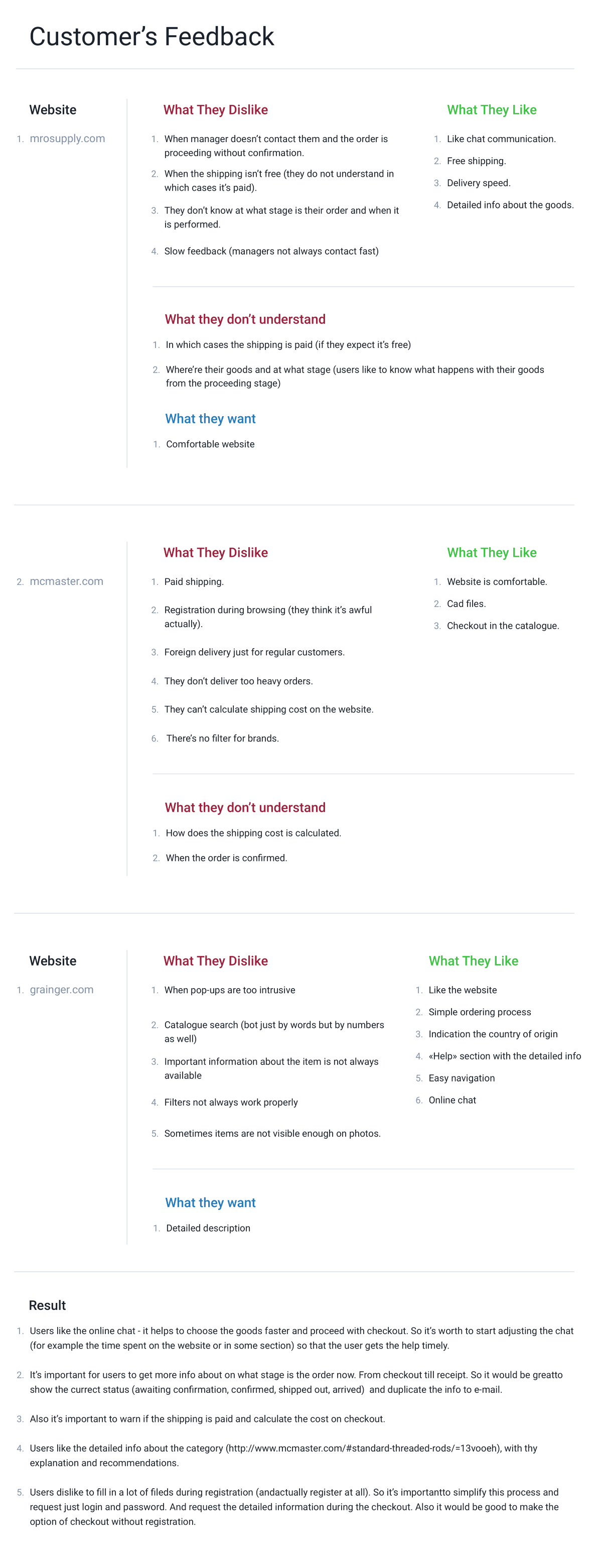
As initially we had not much time for the research, we have analyzed just the two websited from the TOP-5 in this industry.
These websites are very different in content, but they have their own problems, advantages and disadvantages to each other.
1. The common thing between two websites was that it’s important for users to see the detailed description of the products on the website.
2. It is important for users that the delivery is transparent and calculated at the stage of order checkout.
3. There were many feedbacks regarding untimely registration, for example on one website user has to register in order to enter it.
Structure of the website and the navigation
According to customer’s request, the current structure has not been changed. The customer underlined his vision with several factors.
1. Current users do not really like changes and if they (changes) are global, then the audience can be confused.
2. This is not very good for SEO. Re-indexing can greatly reduce the website’s position in the search results (now it’s more than 50,000 users per month).
In general, the website has fairly clear structure, but the content was displayed in kind of chaotic manner, so we mainly dealt with the refinement of what already existed, and expanded the functionality according to new requirements.
There also were few items on the website that needed to be fixed.
The first item was connected with the registration. To register on the website, it was necessary to fill up a huge form, which has an auto-check in all fields.
Users told about this inconvenience directly. That’s why, at the first stage, we decided that the user would fill up a simple form with several fields. And after he begins ordering goods, propose to fill a large form with all the necessary fields. This solves two problems at once, the first one — the user does not need to bother about filling out long forms at the beginning, the second is that the website will be able to send a reminder to the user by mail about the product left in the Cart.
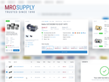
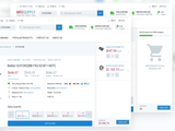
The second item was connected with the Cart. Since it was not in sight, and there were a lot of goods in it, it was necessary to make sure that the user could always keep it in sight; therefore, at the request of the customer, it was made similar to the Cart at www.jet.com, so user can always see the list of his goods.
