Lumyros: Stylish application for adventurers and aurora hunters
by
Pixelfield
About
During the Northern Lights, a huge number of enthusiasts travel every year. But how to hit the right time, or not miss the right moment?
Visual identity
The client had a pretty clear idea of the functionality of the application, because he personally spent years hunting for aurora borealis and communicating with other hunters and tourists.
In the first phase of the project, we focused on a summary of documents and roadmap planning. So far, our team of designers has been working on the visual identity of the future product.
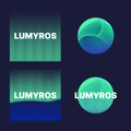
Of course, we were inspired by the aurora itself and chose a design that evokes both color and other elements across the application.
Prototyping
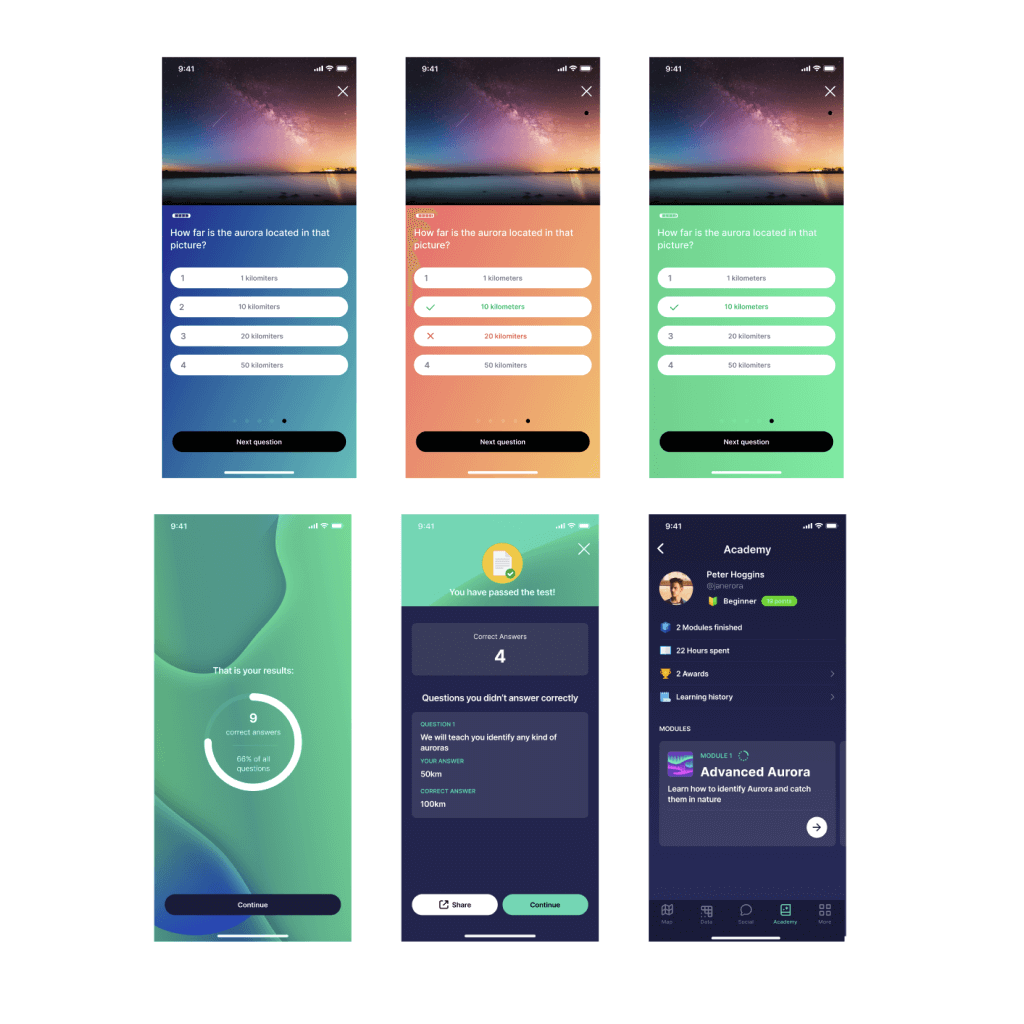
The UI and UX design of Lumyros was a challenging task. And that's right. Prototyping and testing of the prototype led to several iterations to make sure that the interface is designed exactly for future users.
The design and development itself were divided into several iterations, which we gradually passed on to our mobile application development team. We have also prepared complete documentation and a handover for developers.
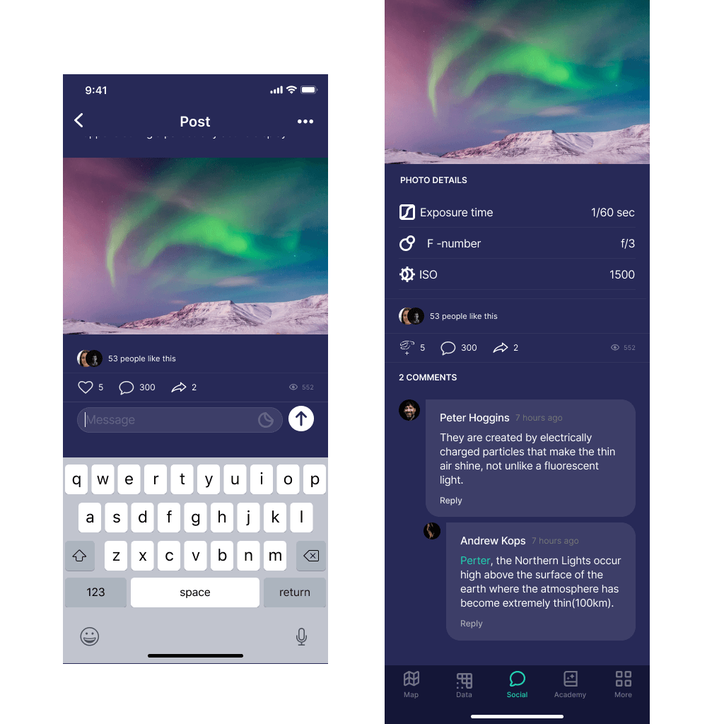
Below you can see some initial application interface designs.
Iterative development
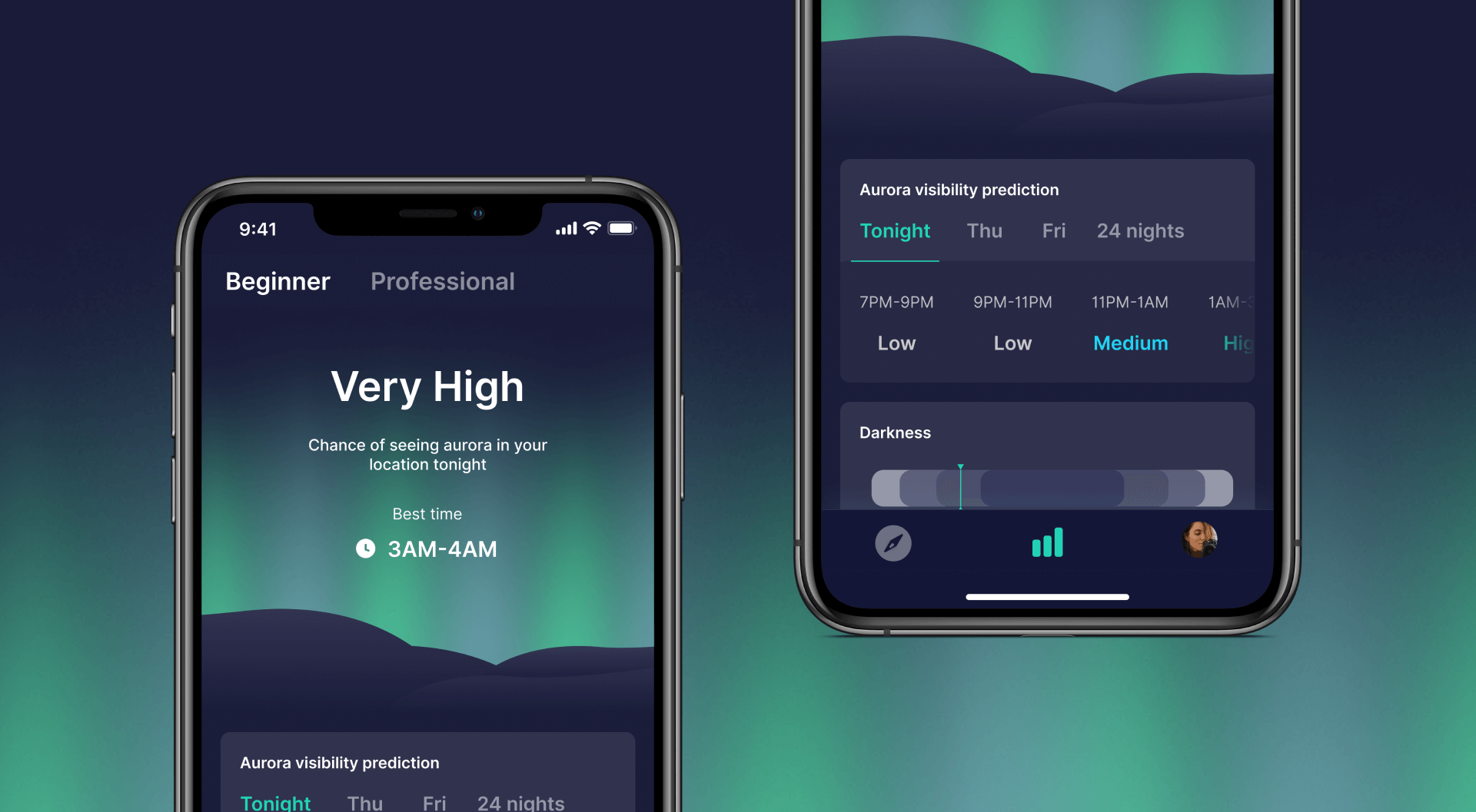
Our development team has prepared a mobile application for Android and iOS. Take a look at the screens below and at the app stores, in our opinion the result looks great.
We developed the basic version of the application within a few months, and in parallel with the launch, we planned and sent further iterations into development.
During the first season, we managed to dynamically deliver more and more functions.

