App Kanku

by
ROCKETECH
About
Challenges
The client came to us with the clear idea of the product - to make an interactive book on Kyokushin karate. Beginning learners often get discouraged by complexities of the techniques. Even a simple movement affects multiple muscles, and keeping track of these specifics on your own is overwhelming.
We had to create a detailed, visualized, interactive, and real-time available mobile book with guidance, images, video lessons, and personalized advice. The goal is to make learning as seamless and intuitive as it would be in a class. Users should have a bigger picture of what’s happening to their muscles during training sessions in order to perform techniques correctly.
Overview of interface and functionality
We faced the challenge by focusing on two directions: intuitive UI/UX design, on one hand, and responsive, fast, seamless functionality on the other. It was obvious early on that the app will work with huge volumes of data (text, images, videos) and we have to compress all these files in order for app to be fast and lightweight. The functionality should also be elaborate but not confusing - so even first-time online learners can get the hang of it.
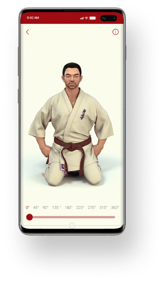
3D body model
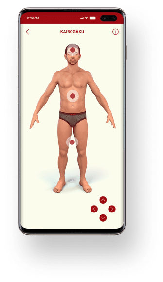
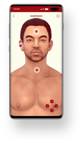
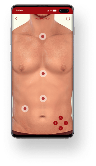
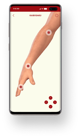
All techniques are visualized with a 3D animated character - a user can zoom in on skeleton, muscles, circulatory and nervous systems, and see internal organs. The application will show the technique from the external point of view (how it looks in the mirror) and from an anatomical perspective.
To achieve this, we integrated and compressed thousands of 3D images, researched anatomical structures, and worked on detailed representation of the human body.
Image rendering
To enable seamless upload of additional learning content, our team developed a custom image rendering system that allowed decreasing the size of multimedia content. Also, we improved the storage system, made sure it can quickly pull out requested files, tested CPU performance, and minimized its waste.
Multimedia pages
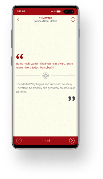
In the Kanku app, users get access to 4,500 pages with techniques, anatomical descriptions, real-time representation, proverbs, and motivational quotes. Theoretical models, practical advice, and encouraging content - App Kanku provides the combination of different learning approach.
Responsiveness
The UI/UX design of the App Kanku was adapted to iOS and Android smartphones and tablets. We made sure that all text and multimedia content are correctly displayed in various sizes and orientation and created several screens for a single multimedia page.
Content Categories
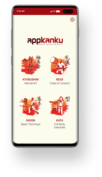
The application consists various types of content, necessary for efficient Kyokushin learning.
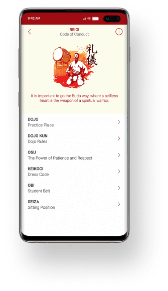
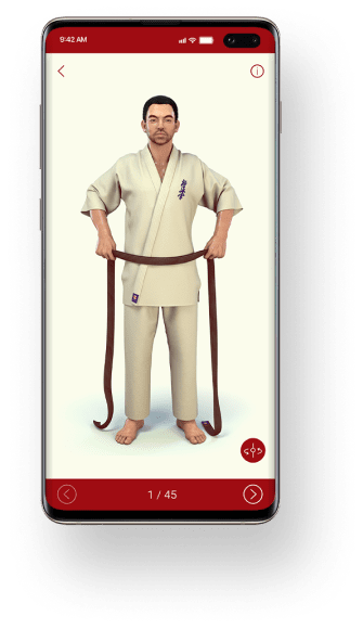
One category is fully dedicated to organizing training environment, preparing clothes, belt, following the main principles of the martial art. Additionally, users can learn Japanese numbers and take a look at a writing system.
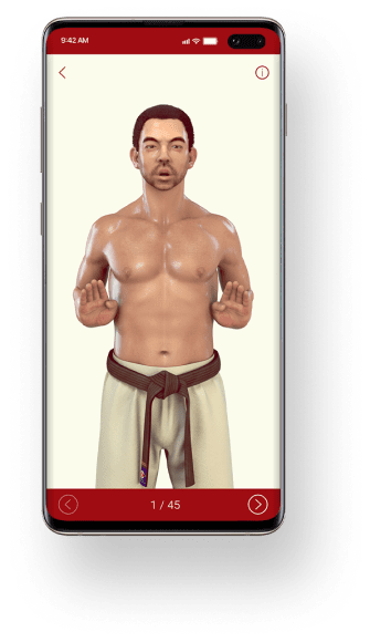
The next category is dedicated to the basic technique: stands, using hands and legs as armour, practicing breathing and learning necessary anatomy.
There’s also a category dedicated to complex techniques: this one is for intermediate and advanced learners who are already familiar with the basic principles of the app.
For all these categories, we had to develop different ways of displaying the content. Some are focused on 3D display of learner’s body, whereas others feature a lot of images and text. Our UI/UX designers analyzed the user needs for each of this category and found the optimal combination of all multimedia materials.
