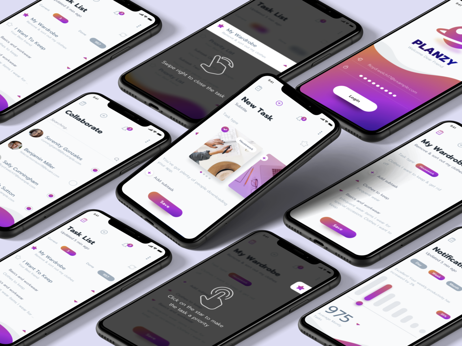
Productivity App

by
CXDojo, Inc.
About
Our customer has developed a special methodology for improving productivity and self-organization, which was based on personal experience, in-depth research, and analysis of various literature. The client wanted to implement this vision and approach in a mobile application that would differ from the standard to-do list apps.
Initially, after downloading the application, the user didn’t understand how it differs from the existing productivity apps. The users also needed to spend some time familiarizing themselves with the methodology by which it would be possible to effectively use the application. In other words, users didn’t understand the true value of the application. A considerable % of the users who had the app installed on their smartphones had low activity.
Our team identified that users didn’t understand the value of the app — they created accounts but didn’t come back to the app. We decided to improve the retention rate by designing a better onboarding flow that would give users direct value in the app. We didn't want to make boring learning screens but instead create tasks that the user needed to close on their own.
The result:
- A month after we released the new version, the number of users who deleted the app decreased from 85 % to 42 %.
- The introduction tips on an onboarding tutorial ensure the user has a full understanding of the app’s purpose and functionality.
- The application got featured on the App Store.
More: https://cxdojo.com/improving-app

