ODEX

by
Rivo.Agency
About
Smart system for selection and delivery of universal wardrobe
Brand strategy
Development
Experience design
User interface design
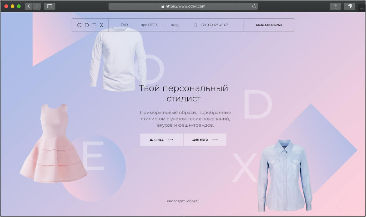
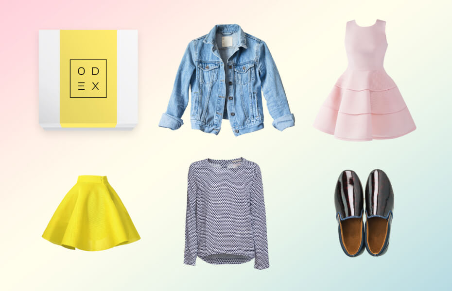
ODEX is clothing subscription service that delivers boxes with
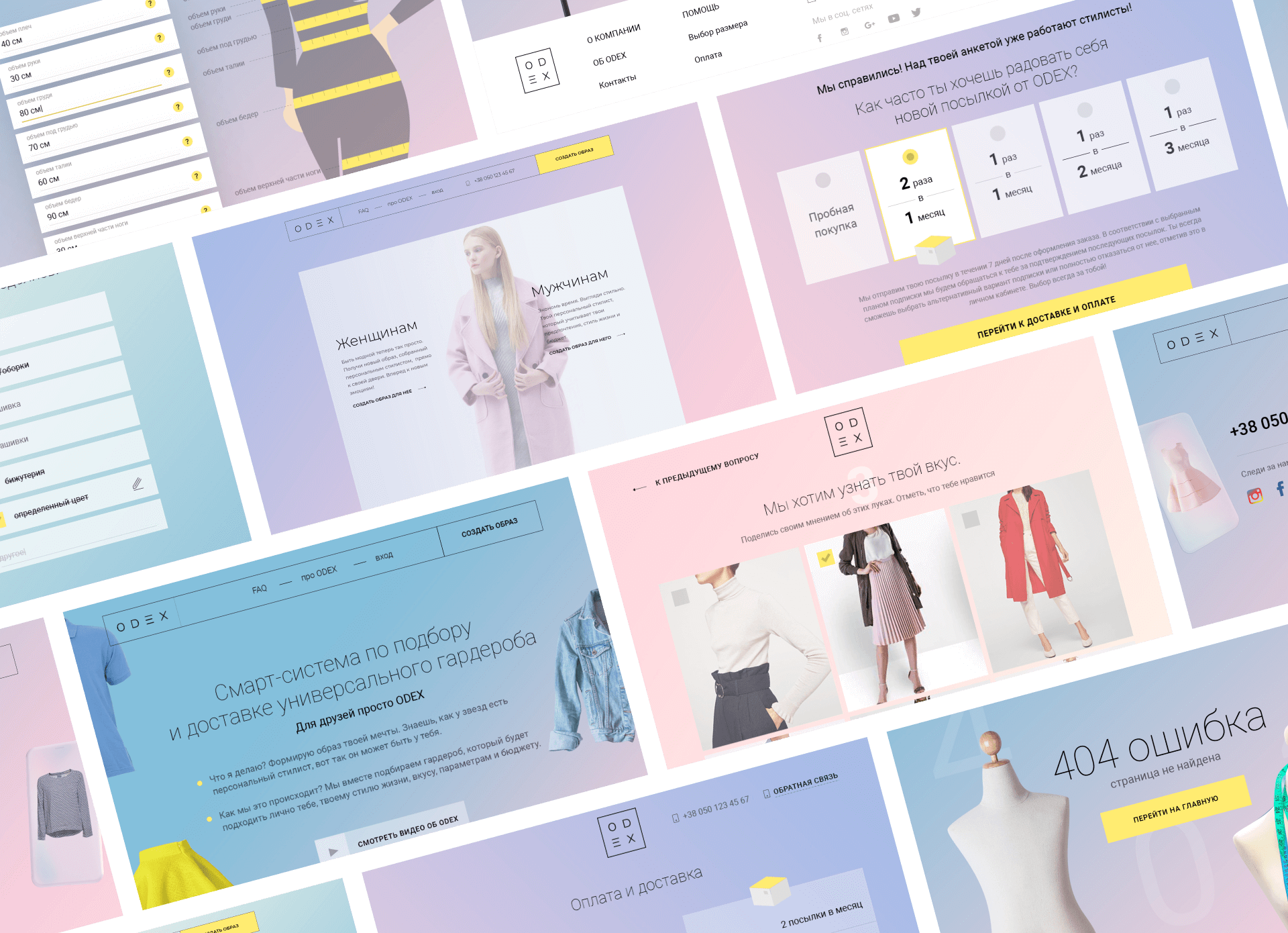
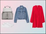
3 hand-selected items based on your style preferences. They came to us and asked to turn their idea into fully functional and scalable website emphasizing easier, time-efficient shopping and personal approach to every customer as benefits of using their services.
Discovery
& planning
Since we weren’t the first web development company they addressed to for creating a website, ODEX team came with a poorly performing website that reflected on bad new customer acquisition. We found ourselves tightened by the client’s limited budget and short timeframes, we took WordPress as a base for the project, however completely redeveloped website so that it could effortlessly cope with a large traffic of customers and integrated payment system.
Nobody wants to spend half an hour filling out a customer profile consisted of 50+ questions to start using services plus wait another half an hour for a website to process the data. In order to improve user experience we chose minimalism: just 3 sections providing full information, easier registration and order collection due to the reduced number of questions, which we rephrased to better identify client’s style preferences and parameters. Constantly increasing number of ODEX’s clients, which are easily tracked through the tool we built in, shows that we have applied proper technologies and designed a user-friendly interface to resolve the issue.
