Khortytsa
by
Kubas Labs
About
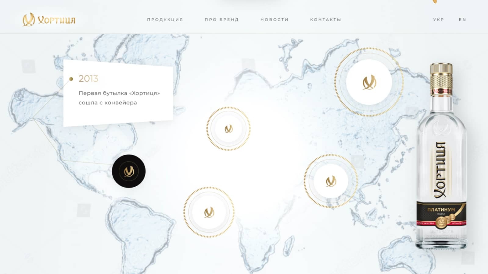
Taking everything we had learned about this admirable company, we built a new website with professional content and photography that highlighted their unique products and beloved recipes.
With a colorful design, an enriching user-experience Khor saw an increase in customer satisfaction and conversions.
Case study
The company had outgrown its current site, which was limited by the design template and lacked interactive features that would improve business processes.
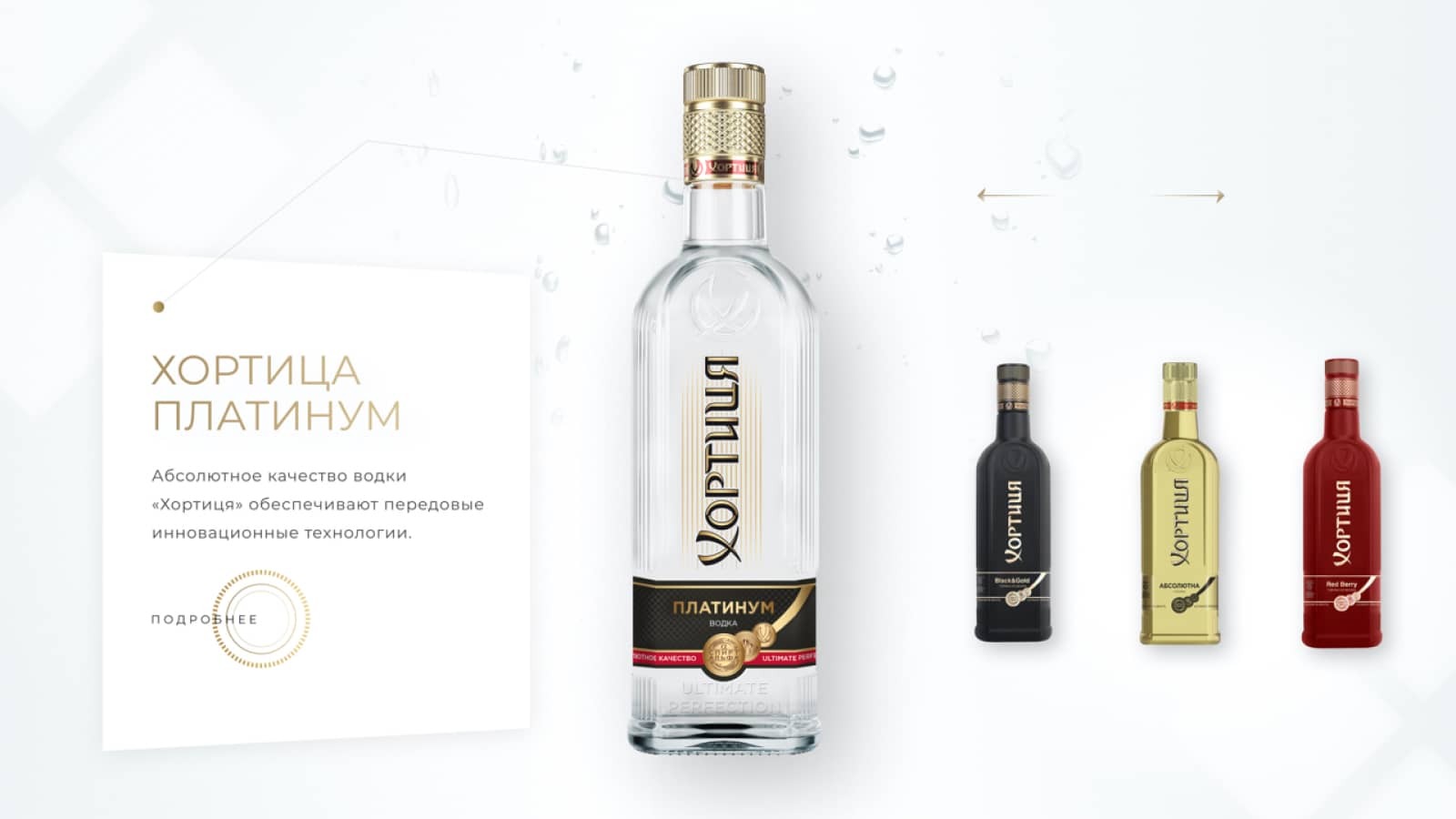
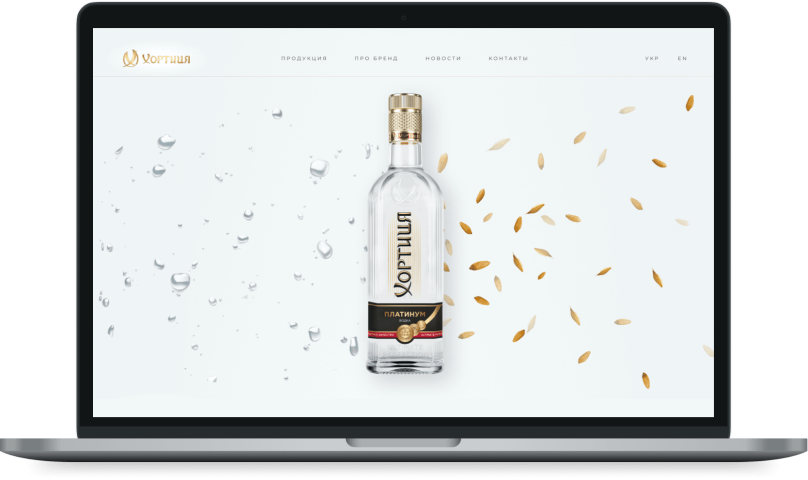
We went for a simple layout for our website. Other than a contact and about page, the site only contains a display page where users can inspect the vodkas on an animated dial. Information on the various products are tastefully displayed alongside.
About project
The company had outgrown its current site, which was limited by the design template and lacked interactive features that would improve business processes.
We went for a simple layout for our website. Other than a contact and about page, the site only contains a display page where users can inspect the vodkas on an animated dial. Information on the various products are tastefully displayed alongside.
